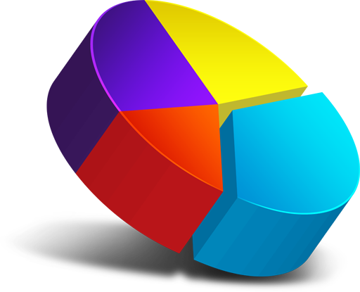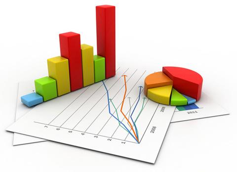

A chart is a graphical representation for data visualization, in which the data is represented by symbols, such as bars in a bar chart, lines in a line chart, or slices in a pie chart.
A Pie Chart is a type of graph that displays data in a circular graph. Each slice of the pie is relative to the size of that category in the group as a whole. The entire “pie” represents 100 percent of a whole, while the pie “slices” represent portions of the whole.
An area chart displays graphically quantitative data. It is based on the line chart. The area between axis and line are commonly emphasized with color.

A bar graph is a chart that plots data using rectangular bars or columns that represent the total amount of observations in the data for that category. Multiple bars are shown in comparison between values.
A line chart is a graphical representation of a series of data points with a continuous line.
There are multiple bar chart settings that show data in different ways.
This example shows a basic bar chart with 1 pixel bar spacings.
This example shows positive and negative value of a bar chart.
This example shows bars with different colours, similar to a pie chart.
This example shows bars stacked upon each other.
This section gives you quick, simple view of line charts used within OPM to get you up and running.
This example shows a basic line chart with high low last highlights.
This example shows a data points chart with with no connecting lines.
This example shows mutiple series line charts with high low last highlights.
This example show a normal range with highlighted out of range points.
Area charts are very similar to line chart.
This example shows a basic area chart with high low last highlights.
This example shows positive and negative value of a area chart.
This example shows a composite chart with high low last highlights.
This demo shows the mouse motion by pixels per second for the last 15 seconds.
This section details other chart types that may be used within OPM.
This example shows a pie chart that displays data in a circular graph.
Discrete charts are made of collections of individual, unconnected points.
This example shows a discrete chart with threshold being highlighted.
This demo shows a random number being generated for the last 15 seconds.
Sparklines omit many traditional chart components such as axes and labels. We can present the data by itself in a sparkline, and we can give users the chance to explore the data’s context through interactions.
This example shows an interactive tooltip that tracks the user’s mouse as it moves across the chart.
This example shows an interactive sparkline tracks the user’s mouse and show additional information in many ways.
Tracking the mouse position makes it possible to interactively annotate the charts.
Interactive annotations can be charts themselves in addition to text.
If you have any queries, comments, criticisms, or suggestions about our products don't hesitate to e-mail us we like your inputs and views.
We are a web solutions developer based in Melbourne, Victoria, Australia. Striving for excellence, simplicity and perfection in developing web products.
Feedback: info@hexicore.com.au/feedbackNothing is more valuable than customer feedback on our products and services. Our goal is to learn more about your business, so that we can understand how to serve you better.
© 2022 - 2023 HEXICORE
Striving for excellence, simplicity and perfect web solutions.